Your 2026 color forecast
Explore the Pinterest Palette™ to meet the top hues before they’re huge—backed by Pinterest insights.
Meet the colors of the year

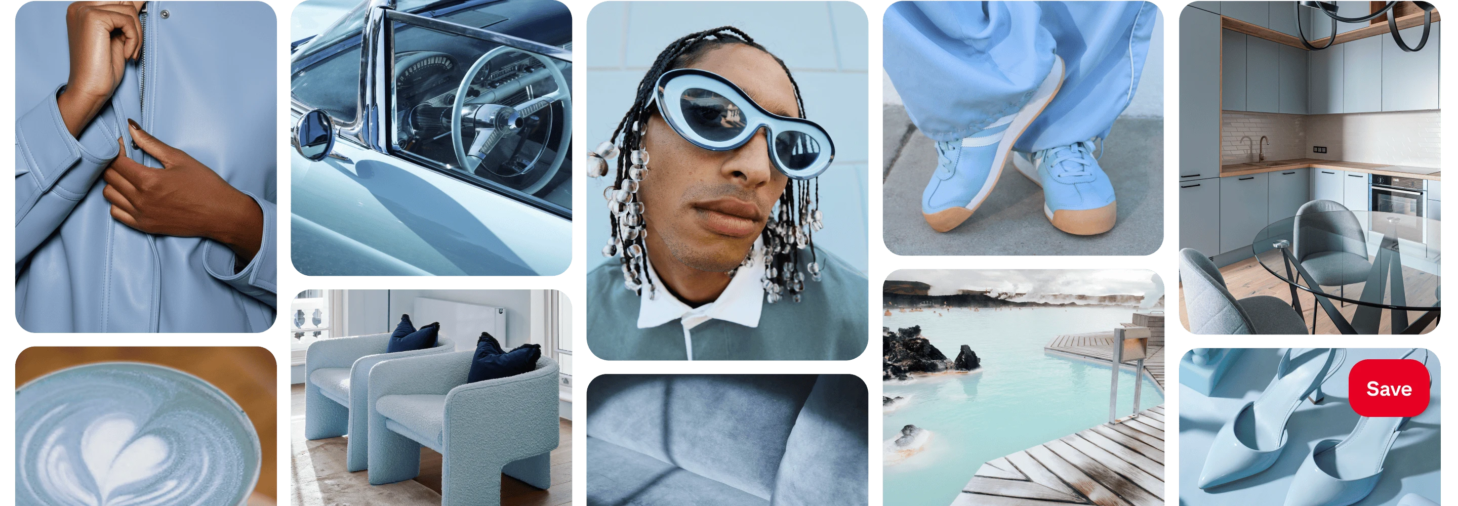
Meet the shade that’s iced out in the nicest way. This frosty hue adds a stone cold chill to everything it touches.
Color values
Hex: #D7EFFF
RGB: 215, 239, 255
CMYK: 16, 6, 0, 0
See footnote 1

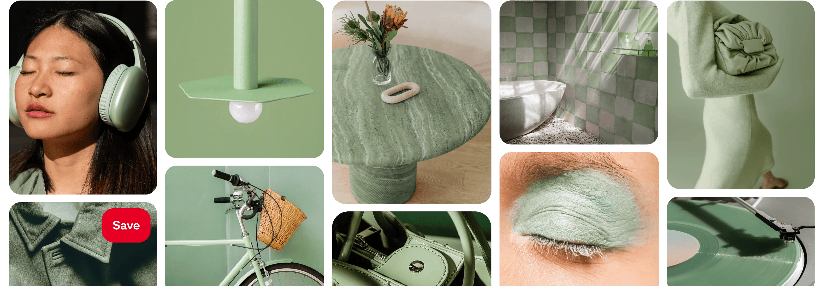
Somewhere between mint and moss, this shade blends serenity and elegance. It’s the glamorous green of all your dreamscapes.
Color values
Hex: #AEB8A0
RGB: 174, 184, 160
CMYK: 5, 0, 13, 28
See footnote 1

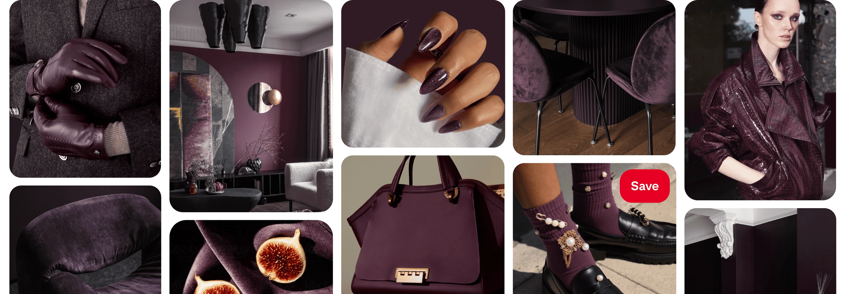
Deep and decadent, this shade mixes notes of burnt burgundy with a swirl of velvet brown. Step into your villain era.
Color values
Hex: #351E28
RGB: 53, 30, 40
CMYK: 0, 43, 25, 79
See footnote 1

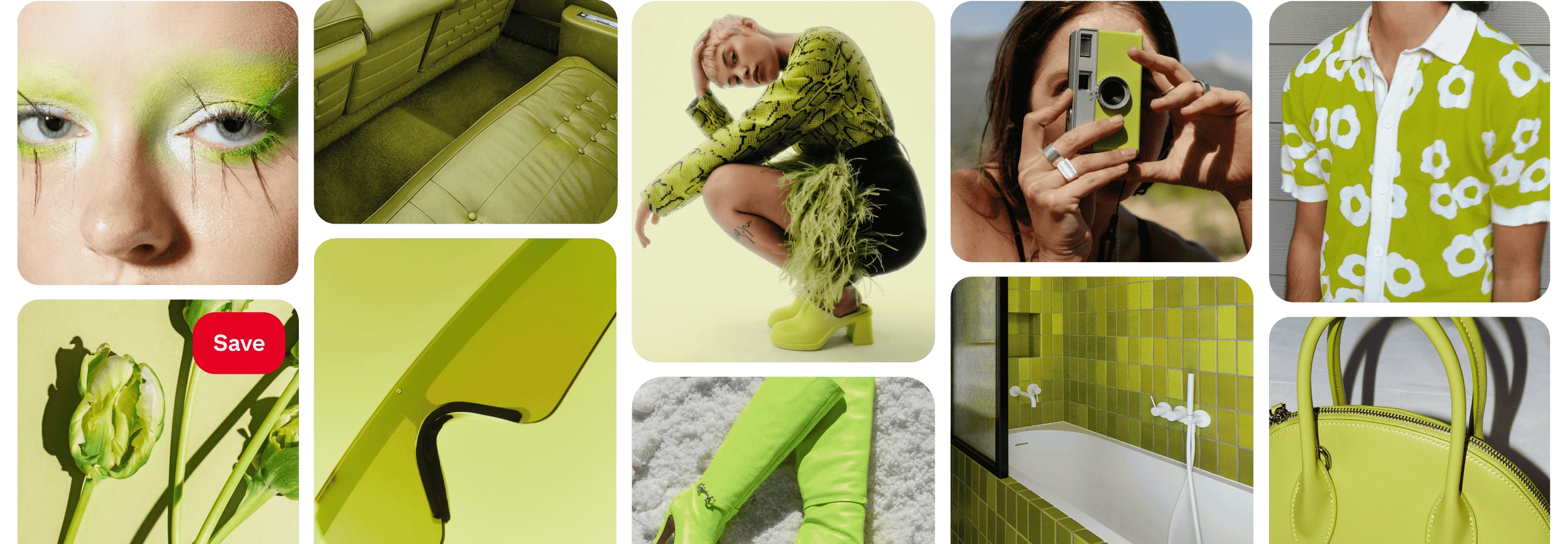
Need a jolt? Wasabi should do the trick. This electric chartreuse brings a vibrant kick to everything from makeup to moodboards.
Color values
Hex: #E9F056
RGB: 233, 240, 86
CMYK: 3, 0, 64, 6
See footnote 1

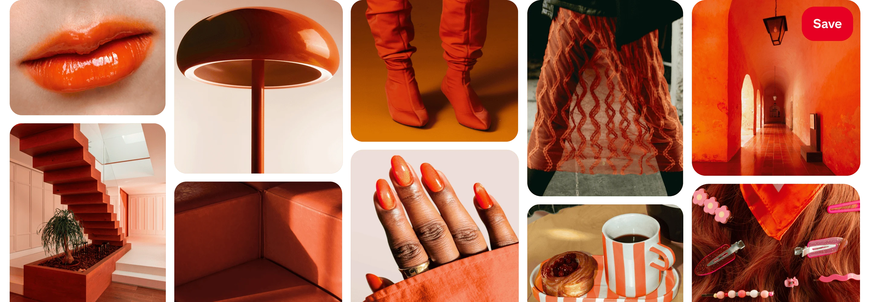
Sweet, sweet heat. Part orange, part red, Persimmon is the feel-good shade making a splash. This color is a burst of pure joy.
Color values
Hex: #FF5C34
RGB: 255, 92, 52
CMYK: 0, 64, 80, 0
See footnote 1
How we find the colors of the year
01
Pinterest spots rising colors early by analyzing billions of searches and saves from 600 million people on Pinterest.2 These real actions show which shades have momentum, before they take off.
02
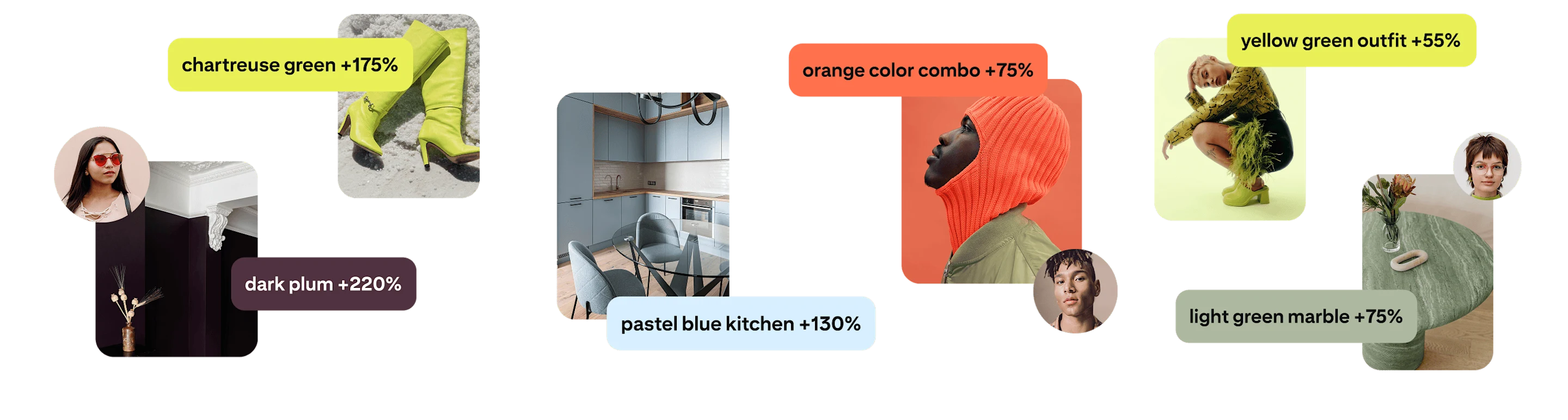
Next, our visual AI looks at images to see what colors and color combinations people love across Pinterest, revealing the aesthetic worlds they are building.
03
In-house color experts turn all this data into cultural insights, map them to exact shades and confirm they show up across fashion, beauty, interiors and more.
Use the colors in your campaigns and creative
Five colors—endless possibilities. Get inspired with practical tips to use these pigments throughout 2026.

Rock a single hue
Go all-in on one trending color for a bold, monochrome look for your Pinterest ad creative. Use Collections or Carousel to turn the feed into a scroll‑stopping color wall.

Inspire a new aesthetic
One thing Gen Z can’t get enough of is discovering new aesthetics.3 Help them shape their vibe by creating color-forward content for 2026 that helps them design their look and their life, with your brand in mind.

Plan details that pop
Use colors from the palette in sets and styling to add quick, on‑brand relevance. Swap neutral components for on‑palette pieces to create clear focal points and a cohesive look.

Think seasonally
Align your campaign creative with seasonally relevant hues. Publish lookbooks or shoppable guides that connect specific colors to brand themes. Think Persimmon for autumn decor, or Wasabi for spring cleaning.

Drive color discovery
Encourage your audience to explore the possibilities and envision these hues in their own lives. Let people experiment with Palette colors through interactive “try it on” tools or Quiz ads.
Make color the strategy
Hyundai KONA paired color‑first targeting with color‑first creative. By aligning exact color queries with creative built around that color, Hyundai met shoppers while they were actively searching and turned a trend into brand momentum—earning a 64% stronger engagement rate vs. auto benchmarks.4
Personalize your palette
Create bold statements with unique, showstopping palette combinations. Experiment with pairing together unexpected shades to make each color combo truly your own.
Inspired by the colors?
Make them yours
Become a premium partner to own a color from the 2026 Pinterest Palette™. Get exclusive sponsorship rights in your market or category to unlock co-branding, a creative toolkit and guidance from our in‑house experts. Contact your Pinterest rep or get in touch to learn more.